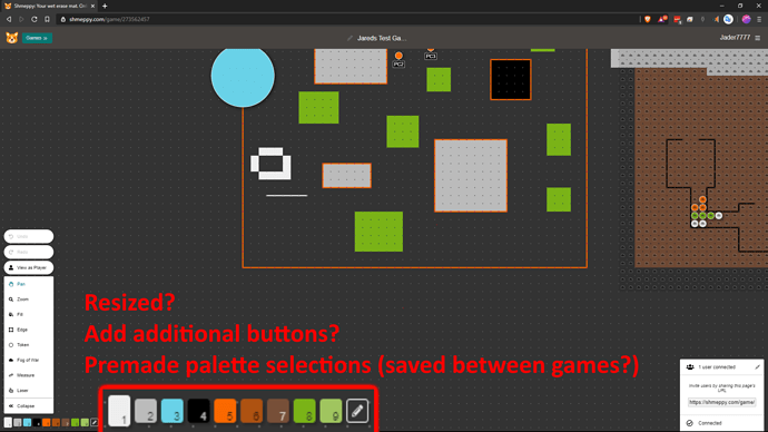
I’ve had some issues with trying to get all my colours to look good during a typical shmeppy game, but also trying to call up colours quickly (A sudden wall of fire, or a smoke cloud) can be a bit clunky and ruin your otherwise very limited selection of colours. Not to mention on a large computer screen the colour selection section is very tiny, basically taking up a single shmeppy square and when hanging on top of an already coloured background can be quite difficult to see.
What ways can you see the colour palette improving?
1 Like
I find myself wanting more than 9 colors, just to help differentiate PCs, NPCs, and foes from the colors that I use on each other and on the backgrounds. As such, I wouldn’t mind being able to add in a second palette to have 9 more colors that you access with Shift+1-9.
Premade palette selections would be nice, though I’m not sure about the implementation. Perhaps a “set current palette as default” option somewhere? I wouldn’t mind being able to save/load multiple palettes, so you could have a Jungle or City palette.
Also, I’ve had trouble precisely selecting colors (especially pure colors that are on the edge of the color picker). I would have preferred a more limited by easier to interact with method, such as a series of arranged colors you can pick instead of the full spectrum.
I’d like a … tint option? An easy way to make a selected colour exactly 10% darker / lighter without stuffing around for shading. That way I could do a bit of shading then get back to the exact base colour without eyedropping. but I’m more on the artistic end of the map making scale
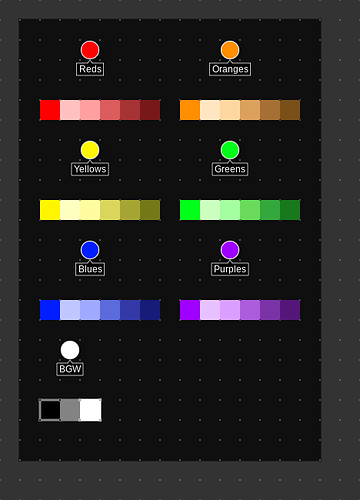
I created this map that i duplicate each time i want to make a new map. Honestly, it works, it’s fast, and it doesn’t ask anything of the developer.
2 Likes

