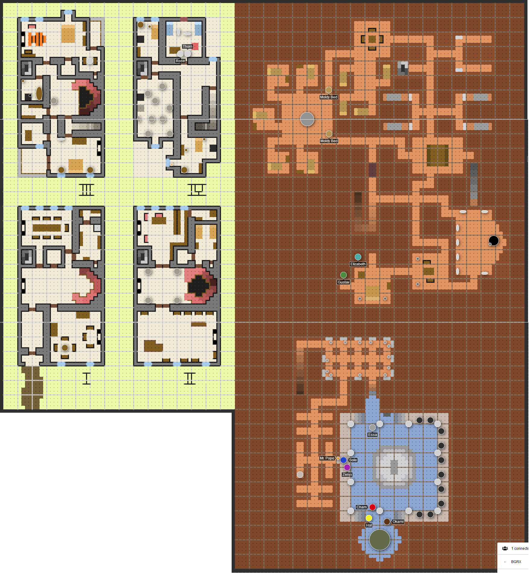
I decided to run through Death House (from Curse of Strahd) with my group. They provide really beautiful maps in the book, and I didn’t know how to show them to the players without serious spoilers or just not show them anything and have to leave the dozens of rooms to the imagination… So I went a bit overboard and recreated the whole thing in Shmeppy. I ended up using roman numerals outside to mark the floors, which went well with the more Gothic setting. I also recreated things down to a 4x4 = 5ftx5ft grid so that I could add more detail, and then added a new grid over top, which let me get pretty close to the vibe the original map was going for. Using Fog of War to open up rooms as they got to them really made the run feel fun. I’m not sure I would do this again for more maps though, it was maybe more effort than it was worth.
(Mod note: I split this off from the other post since the first part of your post was a response to the original thread but this part seemed like it belonged in a new thread)
This is rad! I love how you increased the grid size, it’s a super cool idea to get more fidelity with Shmeppy. I can imagine why you’d feel like it was a bit too much trouble in the end though  .
.
I did get really familiar with Shmeppy’s tools in the process though, which was nice! I think the main reason I found it to be so much trouble is I really wanted to capture the essence of the original map. Like did I really need the gradients on the staircases, or the stripes on the tiger rug? Probably not, but they were cool looking.
The main things I found hard were:
-
Even the most zoomed out level of Shmeppy wasn’t zoomed out enough to really view the whole thing. This was a bit annoying when doing things like drawing the long lines across the whole map, but also led to a couple instances of “okay now scroll over to the right because there’s more stuff over there” while playing.
-
The limited color palette + no hotkeys for the colors really got frustrating at times. I had to think very consciously about which colors I was going to use again and which ones I could change to make things like gradients. I’m not sure what the perfect solution to this is, but it was definitely a pain point.
Legit! I feel like importing images is the real solution to some of this, since recreating cool maps in Shmeppy always feels a little eh (though also cool… pros and cons).
There’s a bunch of “large map” features that I think will help with this. Big map pain seems to be one of the biggest pain points right now.
Hotkeys will probably land pretty soon. I gave all the toolbar code some TLC recently and it should be particularly straightforward to add the UI hints that I want (ie: I was the palette color hotkeys to be discoverable). Letting folks add more slots to the palette is probably nearish at hand as well.
This looks amazing! I love the zoomed-in custom grid, that’s a great idea. And I feel you with those colour gradients…I’ve been trying to keep my maps to 3 or 4 main colours specifically so I don’t have to keep messing with the colour bar. But those gradients on your stairs look gorgeous. Looking forward to those palette updates for sure.
A bit late to the party, but those maps do look amazing. You did a good job bringing them over and scaling the grid.
This is a very cool and faithful recreation of the map in the 5e book! Love the details like the ‘tiger rug’. 