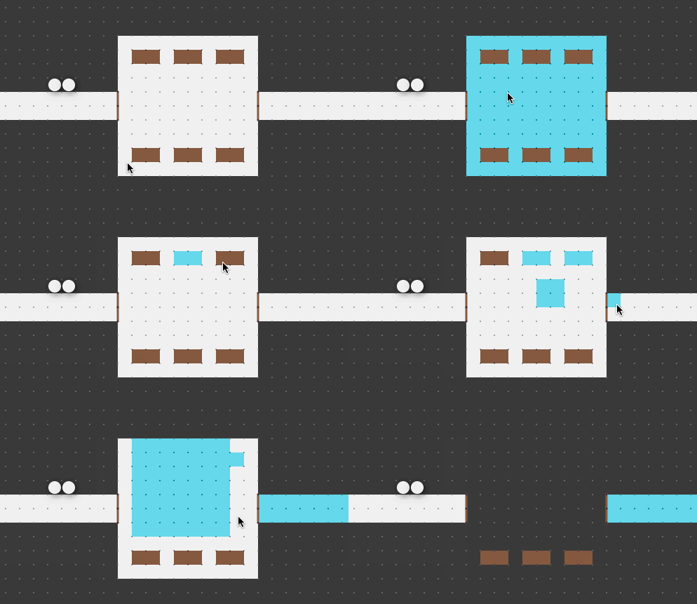
@Learuis had the idea of just shift clicking, rather than double clicking, to flood fill. Making double clicking work has been very challenging from both a technical and UX design perspective, so I was pretty pumped to try it out.
After implementing it, I found I liked this interface much more. It certainly seems like a better place to start. Sorry to those of you who are already getting used to the “double clicking” interface, I don’t like changing hotkeys/activation-methods in Shmeppy, but hopefully this isn’t too bad since I only released this yesterday.

Please continue sharing your feedback with me. It’s super useful.
Happy Shmepping ya’ll!
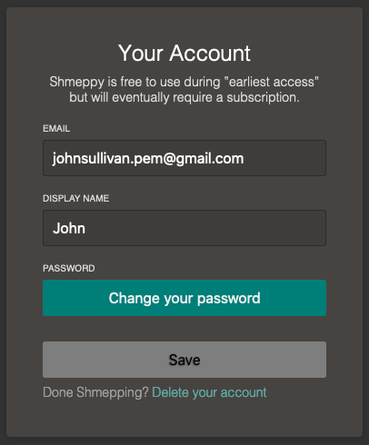
P.S. I also did a little reskinning of the account page, it looks slightly nicer now hopefully:
