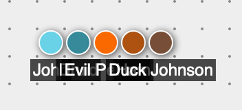
Labels on tokens are pretty important. In the past, these important labels could easily get obscured. Like if you had some tokens in a line:

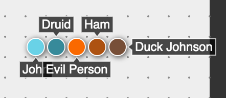
I’ve just landed a change that attempts to minimize the amount of “obscuring” that happens. See this same scene now:

Notice that it’s not perfect, “John” is still slightly obscured, but it’s much better than it was.
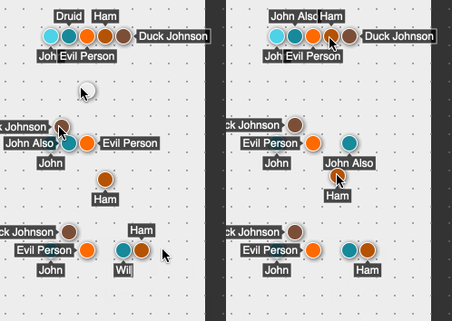
This change was big. There was a lot of details to pin down, mostly around what happens when you’re moving and editing tokens.

I definitely welcome any feedback on all of this, and I suspect I’ll be tweaking and polishing this new feature for awhile.